Hey guys, thanks for the good work on the proposal! Special thanks to Ron, TY and Carrie who stayed back to complete the proposal yesterday. And to Dz who helped me to vet through the thing today!
Also a big thanks to our fans who have played Mobile Weapon: Zero and helped us to get some good numbers. Keep supporting us by spreading the word about our game and sign-up for Mobile Weapon: Episode 1. Due for release early July 2006!
Singapore based Games, Mobile Technology and Business software developer
TYLER Products
Wednesday, May 31, 2006
Sunday, May 28, 2006
Mobile Weapon Developer Diary #22
Attributes and stats:
Pilot:
1. Reflex: Evasion/Guard
2. Accuracy: Hit
3. MaW Proficiency: Fuel/energy discount
4. Weapon Proficiency:
---Heavy Ranged
---Light Ranged
---Melee
MaW:
1. Base Armor: Damage reduction
2. HP
3. Energy output: Recharge Rate
Pilot Class:
Novice,
can learn- Minor repair
can learn- Block (chance to guard)
Advances to- Fighter/Marksman/Mechanic
Fighter,
can learn-Dual Strike
can learn- Stun
Advances to-?
Marksman,
can learn- Rapid shot
can learn- Aim
Advances to-?
Mechanic,
can learn- Repair(self or party)
can learn- Recharge
Advances to-?
Mobile Weapon: Zero, DE-BRIEF
I realise we haven't had a proper de-brief after the launch of MW:0. Derek is probably going to complain about this. But after much thinking and discussion and consideration; I think we ought to keep the same battle system as MW:0.
Think about it. Fine it's not multi-playable, but it's definitely much faster paced and is more popular with a majority of people. It's also simpler and has wider appeal.
Here's a small preview of what's the come in MW:1. RPG Quality Grass texture!
 Done by TY and I.
Think about it. Fine it's not multi-playable, but it's definitely much faster paced and is more popular with a majority of people. It's also simpler and has wider appeal.
Here's a small preview of what's the come in MW:1. RPG Quality Grass texture!
 Done by TY and I.
Saturday, May 27, 2006
Mobile Weapon Developer Diary #21
Things are taking shape. We've got good encouraging reviews from our Newgrounds launch of Mobile Weapon: Zero.
Now the challenge is to get MOBILE WEAPON Episode 1: Tropical Storm (name subject to later changes) ready by July and show the world what MW is about!
So far from our discussion for today we've come up with the following:
Locations:
Starting Town - ??? Name (Ron's Garage, Clothes Shop, Cafe, Inn, Guilds)
Jungle #1 (Ally #1 house)
Jungle #2 (Chasm & bridge, Petshop -> Pets game)
Jungle #3 (Forest Boss)
Beach #1 (Pier -> Fishing game??)
Beach #2 (Fried Rice Stall)
Scrapyard
Mine #1 (Mine Entrance)
Mine #2
Mine #3 (Mine Boss)
Tidal Cave (Bandit Boss)
Transport Town (Airship dock, Armor Shop, Weapon Shop, Bar, Ally #2 house) - ??? Name
Characters:
Uncle Ron - Ronnie
Fried Rice Hawker "Mr. Chow Fan" - Malc
Clothing Shopkeeper - Carrie
Cafe Owner - Derek
Cafe Patron(s) - Derek
Waitress - Laura / Carrie
Weapon Shopkeeper - Daizhong
Armor Shopkeeper - Leonard
Bartender - Leonard
Fisherman - TY
Petshop Owner - TY
Ally #1 "Calico" the Weapon Master - Leonard
Ally #2 "???" the Mechanic - Carrie
Foreman + Miner(s) - Ron
Smuggler (Secret shop)- Derek
Townsfolk - TY
Transport Station Master - TY
Beachbabe (temp character) - Laura
Named townsfolk #1 - ???
Named townsfolk #2 - ???
Quests:
Uncle ron
- Go look for Ally #2
- Search for parts in scrapyard
- Collect Plasma Rock
- Deliver something #1
- Deliver something #2
Clothes Shop
- Find material for clothes
Fried Rice Hawker "Mr. Chow Fan" - Find ingredients
Unlocks -> Fight him for secret weapon!
Unlock Areas Quests (Puzzles)
- lower the bridge
- Gain access to tidal cave by going at the right time of day
Mobile Weapon: Zero is out now!
Thursday, May 25, 2006
Nokia unveils first range of next generation mobile games
Nokia unveils first range of next generation mobile games: Nokia News
Wednesday, May 24, 2006
Mobile Weapon Developer's Diary #19
Monday, May 22, 2006
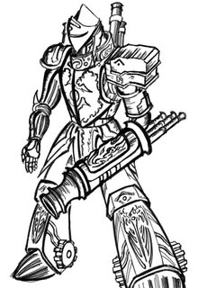
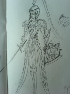
some drafts
Sunday, May 21, 2006
Mobile Weapon: A new direction?
This morning I've come to a revelation of sorts. I'm sure you guys will also have noticed this but Mobile Weapon: Zero which is meant to be a teaser game to promote Mobile Weapon is actually MORE fun than Mobile Weapon itself.
What I propose is this: We still launch Mobile Weapon: Zero as planned. But we work on created a souped up version of Mobile Weapon: Zero.
A Mobile Weapon RPG that will be release in episodes (because we can't possible complete a whole RPG by next month). This will give use more time to build up the necessary assets (3D models, game codex infomation, graphics, etc)before launching Mobile Weapon: Online.
Advantages of this approach are:
1) Use tested and proven fun gameplay
2) More time to introduce the world of Sios to gamers
3) Introduce the exploratory aspect of the game earlier
4) Still retains the shopping and shops appeal
5) We can actually earn some direct $ by selling the game (only the mobile version)
6) More farming!!!
Characters
The main character can be user created (either male or female) and the game will have 2 characters which can join the main character's party.
Battle
Battles will be tactics style using our existing combat engine but in a turned based mode. We can reuse the old grass background and create some desert terrain for the battle engine.
Episode 1:
You are stuck in your home town (which is some remote beginner island on the Sios map) because some boss or whatever has disabled the train / airship. You will need to find the plasma rock or whatever to power the airship and defeat the boss to get to the next main continent of Sios.
Saturday, May 20, 2006
Wednesday, May 17, 2006
Mobile Weapon Developer's Diary #17
Progress is going underway to tweak the game:
In-game statistics
1) Place ratio of hitpoints of melee bots to be 1000, ranged bots to be 700 and specialized bots to be 500
2) Damage ratios of melee/ranged/AoE/healing to be rough ratio of 150/100/70/120
3) Place limited ammunition for AoE and healing items to prevent abuse, setting AoE charges to 4 and healing charges to 2
4) Place limited charges for teleport setting it to 3
5) Place ATB usage of the following actions (movement/melee&ranged/AoE/healing/teleporting) to be the following ratios: 3/4/5/5/5
The following usability changes has been added:
1) Inclusion of a cancel button
2) Feedback on screen scrolling in terms of buttons
3) Feedback when in-game action is performed by the bot, such that the button used is highlighted – However, the unselected icons are too unobvious (too transperant)
4) There is an alternate version with the combo-critical system
5) Feedback on how much gold and experience is earned for every hit (but I think what I did is really ugly for now)
6) Restricted player's movement such that if they overheat, they can only start performing actions after the energy meter reaches 50. Ok I realise, this kinda slows the pacing quite a bit, but it kinda solves the "reverse wind" problem everyone's been talking about. But then there's the trade-off. Can be changed back.
7) The indicator for "Which robot is mine" is more obvious since there's more movement for it now and a bright shade of orange.
The following are being looked into and coded:
1) More obvious which robot is the user when game starts
2) Team colors
3) Team speak in chat room and easier ways of viewing the chat
4) Exploring into other forms of communication other than the chat box, example allowing players to ping the map or have fixed and more obvious communication options coded in like ‘charge/retreat/help’
Known Bugs to clean up:
1) On logout from ingame, parts of the ingame interface remains on the login screen, trying to start another game leads to a strangely colored diamond shaped object in middle of screen and hangs the application.
Additional requests:
1) Ensure that all damage/experience/gold messages in-game do not are not generated offscreen
Sunday, May 14, 2006
Mobile Weapon Updates and Objectives
Hi guys,
We've got a demo to Starhub coming up soon although the date has not been fixed yet (week after is a safe assumption, I can't stall for too long). Based on the last demo we did the game needs to be more refined since we'll be facing a tougher audience this time round.
I've got to be outta here in 25 minutes so I can just set some rough objectives we need to achieve before next week.
- Theme Consistancy. Sorry I haven't been able to pin this down precisely for you guys, I promise to work with Ron, TY and DZ more closely on this. But I think the general conclusion from Friday's meeting was more cute, more color and more appeal for girls.
- Add more color to the deck of the airship.
- Female Bot , please try to get her done ASAP, sorry for the rush but it's necessary.
- Animate the pilot's portrait in the controls interface, we need more moving parts to add to cheap thrill factor. Use the new 3D models.
- Explore if the combo-critical system I suggested will be feasible.
- Explore how "SUPER" / "OVERDRIVE" (call it what you will) can enhance the gameplay. Quite a number of our competitors games have a limited or charged super power to add some strategy element.
- Balance the game number range. Find an acceptable range for the HP, damage, etc values. Remember we are only at the beginner phase, wouldn't want damage numbers to reach a few million when we hit the S class series.
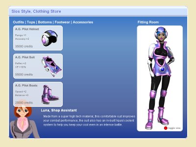
By the way, I'm doing up the clothing shop so PLEASE DON'T double job. you guys might also want to leave the garage (MAW parts shop) system revamp for me to do for the sake of consistancy. Read this blog for updates and post your own updates when done. Thanks!
We can all take a few days off and nice holiday when this is over, but for now I really can't stress how important it is to get our demo and launch right better than expectations. Thanks for the hardwork in advance guys.
Well, at least you guys can go on that holiday before me. :-(
Will be missing you guys. See you on Saturday. RAWR!
Cheers,
Leonard
We've got a demo to Starhub coming up soon although the date has not been fixed yet (week after is a safe assumption, I can't stall for too long). Based on the last demo we did the game needs to be more refined since we'll be facing a tougher audience this time round.
I've got to be outta here in 25 minutes so I can just set some rough objectives we need to achieve before next week.
- Theme Consistancy. Sorry I haven't been able to pin this down precisely for you guys, I promise to work with Ron, TY and DZ more closely on this. But I think the general conclusion from Friday's meeting was more cute, more color and more appeal for girls.
- Add more color to the deck of the airship.
- Female Bot , please try to get her done ASAP, sorry for the rush but it's necessary.
- Animate the pilot's portrait in the controls interface, we need more moving parts to add to cheap thrill factor. Use the new 3D models.
- Explore if the combo-critical system I suggested will be feasible.
- Explore how "SUPER" / "OVERDRIVE" (call it what you will) can enhance the gameplay. Quite a number of our competitors games have a limited or charged super power to add some strategy element.
- Balance the game number range. Find an acceptable range for the HP, damage, etc values. Remember we are only at the beginner phase, wouldn't want damage numbers to reach a few million when we hit the S class series.
By the way, I'm doing up the clothing shop so PLEASE DON'T double job. you guys might also want to leave the garage (MAW parts shop) system revamp for me to do for the sake of consistancy. Read this blog for updates and post your own updates when done. Thanks!

We can all take a few days off and nice holiday when this is over, but for now I really can't stress how important it is to get our demo and launch right better than expectations. Thanks for the hardwork in advance guys.
Well, at least you guys can go on that holiday before me. :-(
Will be missing you guys. See you on Saturday. RAWR!
Cheers,
Leonard
Thursday, May 11, 2006
Monday, May 08, 2006
Sunday, May 07, 2006
GIANT LIGHTBULB APPEARS!
I know what we need to make our game fun liao! RAWR! We need a slider bar that goes up and down then you need to press at the right moment to get max damage!
All other free games have this feature! So we must have it too! RAWR!
All other free games have this feature! So we must have it too! RAWR!
Thursday, May 04, 2006
Mobile Weapon Developer Diary #15
This should be the finalised logo. Not going to do another one till version 2 comes out. :-P

I realised that the traditional concepts of logo design (must be printable in 2 colors, simple design, etc) don't apply to game logos. You can have them as intricate as you want (sometimes the details, the better).

I realised that the traditional concepts of logo design (must be printable in 2 colors, simple design, etc) don't apply to game logos. You can have them as intricate as you want (sometimes the details, the better).
Subscribe to:
Comments (Atom)

