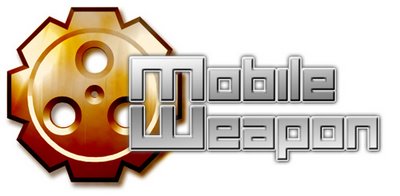
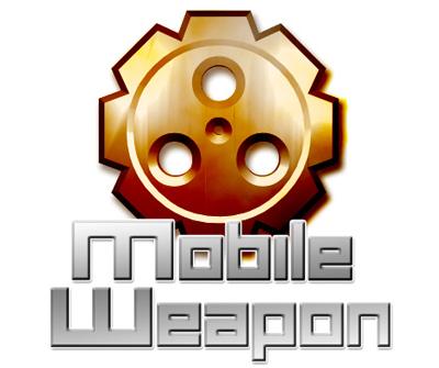
Vote for your favourite logo or tell us which parts of the different permutations you like!
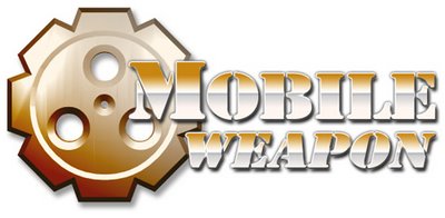
Logo 1: Fonts remind me of a certain arcade game

Logo 2: Made the font colors consistant
Logo 3: Upgraded the textured feel of the cog. Thanks to Malc for this suggestion
Logo 4: This is using an original font create by me!
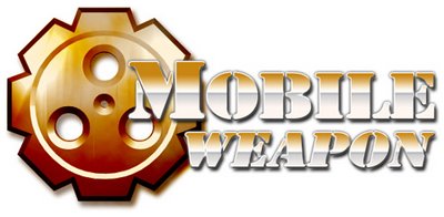
Logo 5: Changed the lighting angle and had a stroke/glow effect
Logo 6: Embossed the fonts for a 3D feel
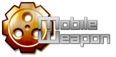
Logo 7: Shifted the words a little

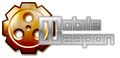
Logo 8: Tried making the cog the center piece
3 comments:
I'd go for the fonts in first one combined with the darker spoke. That or pic 6, since both versions would have a more metallic feel and a greater contrast between the fonts and the spoke.
I vote for 6 and 8. But I got a thing for the stroke/glow effect I created for 5.
v5, 6, 7 and 8. v6 and 8 looks better though, but I like the soft look on 5 and 7 which can be used without the gear if required.
v8 looks exactly like what we need on the loading page.. quick pass me the gear.
Post a Comment